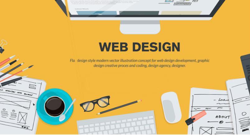
Website design has grown into an art form unto its own in the current day-and-age. A broad spectrum of teams put their time and energy into a website in order for it to come to fruition, the gamut running from development to executive. Once it reaches completion, your website becomes the first impression your brand has on visitors to the site. Businesses often design their websites with visual appeal at the forefront of their priorities, while website functionality takes a backseat: a mistake that can be rather costly when marketing their services through their website.
In a recent discussion on website creation, I heard a phrase on what you want your website to be in order to leverage it from a marketing standpoint: “Simple, Intuitive, and Effective.” Those three words rang home with me and I hope they will with you as well:
Simple
When you are designing your website, you want it to be visually appealing. After all, attractiveness is the foundation of any marketing strategy. However, oftentimes we become carried away with focusing on our websites being pretty and less on accomplishing their purpose. The use of unconventional and interesting designs in order to separate your website from others may dissuade visitors from spending more time on your site.
Coupled with the distractions of a complex website are the slower load times. Maintaining the attention of visitors to your website becomes increasingly difficult with the bombardment of input from multiple platforms. This makes the speed at which your website loads critical to converting visitors into customers. Checking your Google Analytics Site Speed reports grants insight into how fast your website is loading, with under four seconds as your target.
- Function over beauty.
- Don’t hide your site’s purpose behind glitz & glam.
- Speed over decoration.
To remix an age-old idiom: Keep It Super Simple.
Intuitive
The most straightforward aspect of website creation is ensuring that it is “intuitive.” When someone visits your site, there should be little-to-no confusion as to what is the next step. There should be a flow to your website, directed calls to action, that carry visitors to the next logical step.
- It should be clear what visitors should do next.
- Display menus and navigation buttons clearly. Do not hide them behind design features.
Effective
Your website can not only look good and be easy to navigate, but it must also be effective in converting visitors into leads. If we envision your website as an actual highway in the shape of a figure eight, we can equate the site traffic as the actual cars on the road. If these cars travel this figure eight, they will continue to drive its length without any exits — eventually leading to frustration, disinterest, and (most importantly) a lost lead.
Now, each call to action on your site would be the equivalent to a highway exit. Some of your traffic may want to bounce at, “Download a case study in exchange for an email address.” Other members of your traffic may choose to get off at “Subscribe to the weekly blog,” while others drive around aimlessly until they see exit “Create a username and password.” The rate at which you convert visitors into leads is the measure of the effectiveness of your website.
- Your website is generating traffic, but is it retaining visitors? Are they checking out available features? Are they subscribing to your mailing list via email?
- Distribute your calls to action strategically throughout your website.
- Give to receive. Make the prospect of sharing information enticing to the visitor.
Have any questions on how Actsoft can help you?
Call (888) 732-6638 or Receive a Live Webinar
 732-6638")


 Actsoft partnered with Odin to provide our solutions overseas, through payment processing integrations. Odin helps us support user management for our software; customers can also purchase our products through Odin’s billing platform.
 VisTracks powers our Electronic Logging Device (ELD) solution, which enables transportation businesses to easily automate their hours of service logs, remain in governmental compliance, and reduce their potential to incur costly fines.
 Integration between Actsoft solutions and BeWhere’s software products is available. Take your team’s asset tracking, cellular data connectivity, and field insight a step further with effective, cross-application compatibility.
 CalAmp tracking devices for vehicles and assets alike are compatible with Actsoft solutions, making it easy for you to efficiently monitor your equipment and fleet cars. Help your team enhance accountability, safety, and savings through a combination of easily installed hardware and intuitive software.
 Gain even greater insight into the daily activities of your fleet using the combination of Geotab and Actsoft. Geotab devices provide detailed data collection and seamless integration with our solutions; learn more about the ways your vehicles are being used daily with the power of this tandem.
 Our partnership with Uniden is ideal for companies looking to gain advanced diagnostics on their fleets. Uniden’s extensive product listing of car electronics like radios, dash cams, radar detectors, and in-vehicle communicators work in concert with Actsoft’s solutions to better connect your vehicles to the company headquarters.
 Kyocera offers a wide range of mobile devices, ranging in design from traditional phones to ultra-durable handset technology. Actsoft is able to equip organizations in a variety of different industries with solutions for improved business, while Kyocera supplies the technology they can flawlessly operate on.
 Motorola’s mobile technology works in tandem with our solutions to provide extra versatility to your business practices. Coupled with our software’s features, Motorola’s reliable devices make connecting your workforce simpler than ever to do.
 Actsoft and Sanyo teamed up to merge intuitive business management software with the technology of today. This partnership allows us to provide you with all the tools your team needs for improved workflows, better coordination, and optimized productivity.
 We’re able to bundle certain solutions of ours (including our Electronic Visit Verification options) with Samsung devices to help your team achieve as much functionality as possible, while keeping rates affordable. Use these combinations for accurate recordkeeping, improved communication, and smarter data collection in the field.
 Our software is the perfect complement to Apple’s user-friendly technology. Equip your workforce with the devices and solutions it needs for optimized productivity during daily operations with Apple and Actsoft.